Visual vs. conceptual approaches to drawing
I have encountered this theme a few times in different contexts now, and I find it really interesting.
Origin of the “tactile” approach to drawing
In The Practice and Science of Drawing, Harold Speed gives an explanation for why children (and adults who haven’t studied drawing) tend to draw the outlines of things. A head is drawn as a circle with almonds or circles for eyes and a triangle for a nose; the sun is a circle, a flower is the outline of the petals, etc.
This type of drawing is based not on how things look, but rather on how they would feel if we ran our fingers around the outside of them, i.e. they are drawn based on tactile information. Things look like patterns of light/dark/color which occupy shapes in our visual field. We recognize things visually more by these internal shapes and patterns than by their outlines, but this fact is not reflected in how we naturally tend to draw.
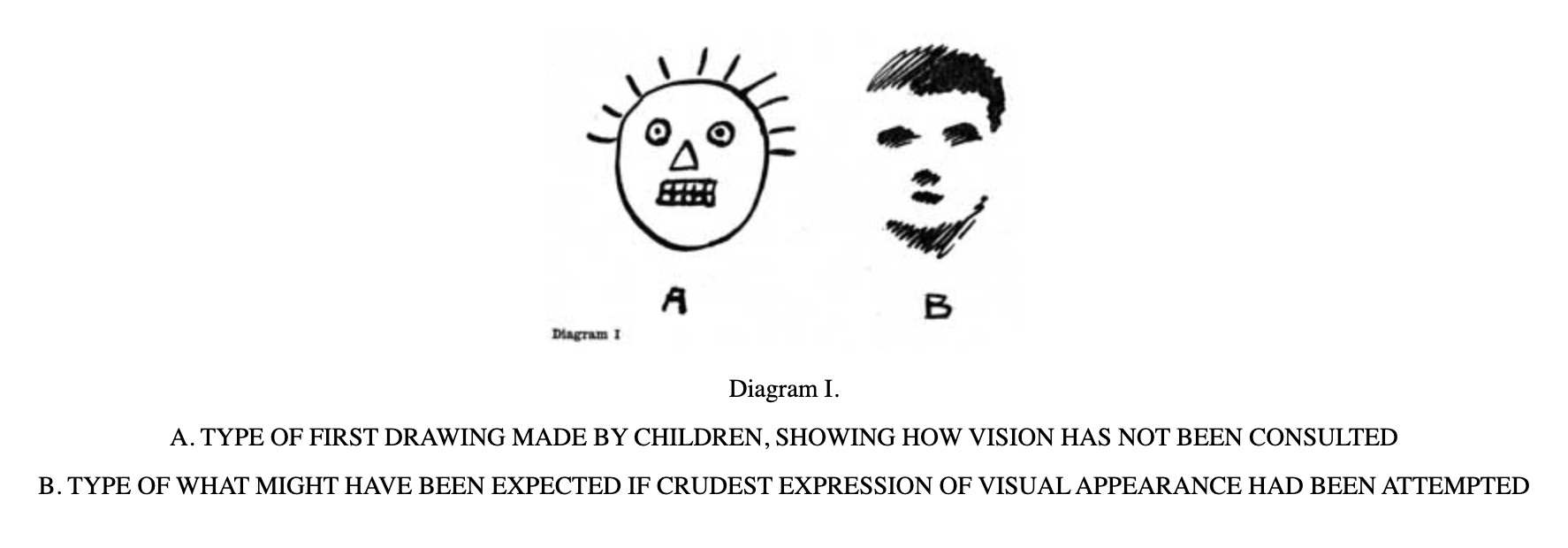
Image from Harold Speed, The Practice and Science of Drawing
Speed explains this phenomenon by the fact that our sense of touch is more primary than our sense of vision. Infants learn about the physical world by touching and grabbing things, and their experiences with touching help develop their visual knowledge. By touching and seeing a round thing, they learn to associate a round “feel” with a round “look,” – a 3D tactile experience with a 2D visual experience.
Drawing the visual impression: “drawing what you see”
When people want to draw realistically and they start to receive instruction, one of the first lessons they will learn is to “draw what you see.” This means to forget about the idea of something (i.e. the mental image of an object that we have in our mind, which is typically represented in a 3D form) and focus purely on the 2D visual impression. This is easier said than done. When we want to draw a nectarine, it’s natural to consult our idea of what a nectarine looks like: it’s more or less a sphere, it’s pink/red/orange, it has a stem coming from the top, etc. Learning to draw requires dissociating our idea of a nectarine - which is 3D, tactile, abstract - from the reality of the 2D visual impression, which does not necessarily have the shape, color, or configuration that our abstract understanding leads us to expect.
Artists use tools or tricks to help us move from our idea of what something looks like to what it actually looks like, e.g. viewing the subject upside down or backwards in a mirror, squinting our eyes to reduce/flatten visual information, step closer or farther away from our drawing, etc. These tools help to defamiliarize what we see. In drawing, just as in other areas of life, believing that we already know how something is leads us to approach it with less curiosity and less ability to see it how it truly is.
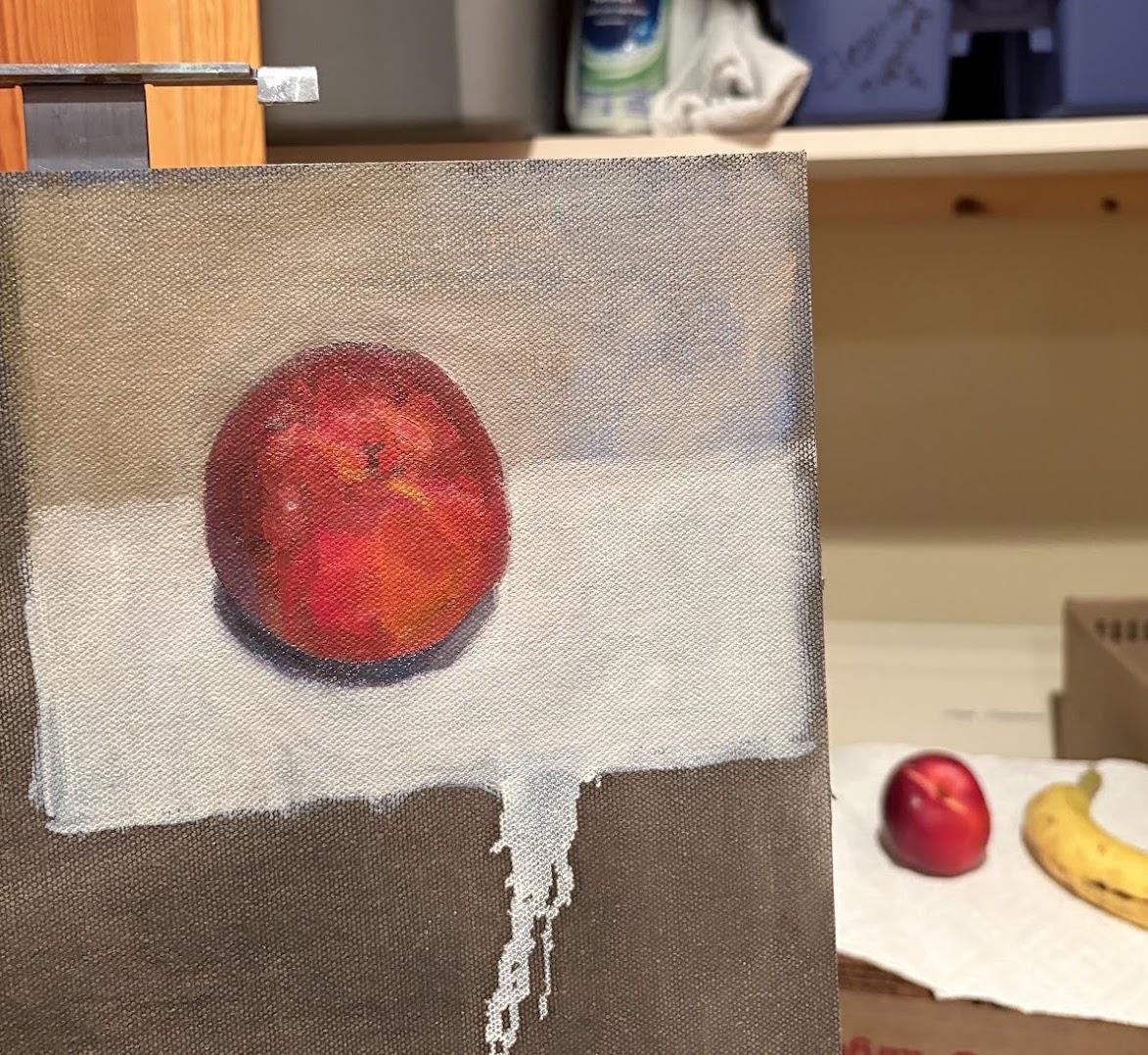
Conceptual idea of a nectarine: round, orange/red/pink, stem is on top
Visual impression of a nectarine: shape depends on perspective; color includes blue, purple, brown, black; stem isn’t on top, but rather a third of the way down…
Conceptual knowledge: returning to tactile and other non-visual information
The jump from drawing based on the idea of something to drawing based on the visual impression is a big step towards creating more realistic-looking drawings. However, ironically, at a certain point it’s helpful to return to the idea of something and incorporate not only the visual impression (“drawing what you see”), but also conceptual knowledge, including our tactile/3D understanding of an object, into our drawing.
I took a workshop with Patrick Byrnes in July 2026, and his teaching about conceptual approaches to drawing, and how they complement the visual impression approach, really helped this topic click for me.
Conceptual knowledge refers to, e.g. principles of perspective, the physical laws of how light falls across rounded surfaces, and anatomy for figure/portrait drawing. We use these types of conceptual knowledge because our eyes do not and cannot see things literally accurately. If we rely purely on the visual impression, the realism of our drawing will be limited.
Why can’t we rely only on the visual impression, or “drawing what we see” to make accurate, realistic drawings? Because our eyes aren’t designed to see things exactly as they actually appear. Our vision is subject to inaccuraces/distortions (some might even be called optical illusions) that prevent us from seeing things as they actually look. Conceptual knowledge allows us to override, in a sense, the optical illusions that, if we were to copy exactly what we saw, would prevent our drawings from looking maximally realistic.
Two examples of conceptual knowledge for drawing
How light falls on a curved surface
Below is a photo of the sphere I used for my sphere drawing project. When I look at this sphere, I only see approximately 4 different tones, shown with labels: lightest light, darker light, darkest dark, and lighter dark. However, if I were to draw it that way (i.e. according to the visual impression), it wouldn’t look like a sphere. This is an example of how the visual impression approach is not sufficient.
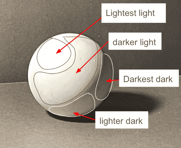
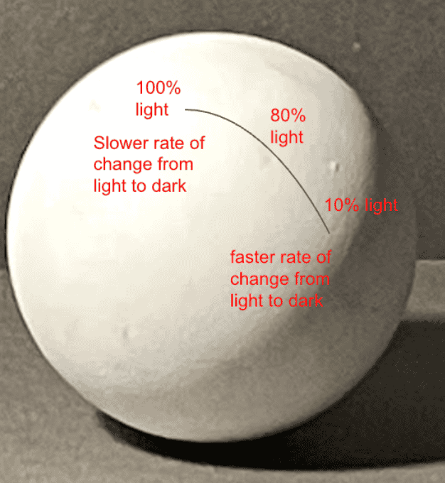
In order to draw a convincing sphere, we have to use conceptual knowledge of how light travels over a sphere. This knowledge tells me that the lightest part of the sphere is the plane directly perpendicular to the primary light source (although it’s a sphere, it’s helpful to imagine it as made up of millions of microscopic flat planes). From that lightest plane, the sphere is getting darker in every direction, and that’s how I need to draw it, even though I can’t actually see these micro-gradations.
Not only do I need to understand that these micro-gradations exist, but also that they do not fall across the sphere in a linear way. The rate of change is much slower near the lightest part of the sphere, and then speeds up dramatically as the line of the shadow side approaches. Another way of putting it is that halfway between the lightest point and the darkest point on the sphere, the light is not at 50%, but rather at ~80%, because the distribution of light over the distance of the sphere is not linear.
Simultaneous contrast
The following image is an example of simultaneous contrast, which means that our perception of a color or value (how light/dark something is) is influenced by what’s around it. The stripe across the middle is all the same tone, but it doesn’t appear that way. If you set out to draw the image below exactly as you saw it, you would likely draw it inaccurately. Being aware of simultaneous contrast, and finding ways to check what we see in other ways (for example, by covering up the surrounding area), helps with drawing more accurately.

"Gradient-optical-illusion" by Dodek is licensed under CC BY-SA 3.0.
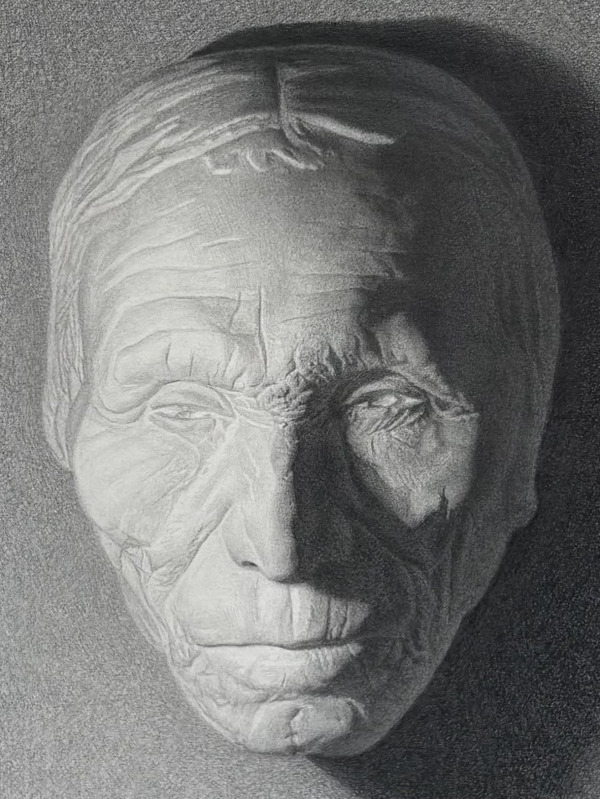
Being aware of simultaneous contrast allowed me draw the cast below more accurately. The left and right cheeks are both receiving light from the primary light source, and visually that light appears about the same. However, this is an illusion created by simultaneous contrast. The light on the right cheek is much darker than the light on the left. In the image below, I used an online color picker tool to isolate the color from the lightest part of each cheek. This shows objectively how much darker the right side is.
Lightest tone on left cheek vs. lightest tone on right cheek:


Summary: three approaches to drawing
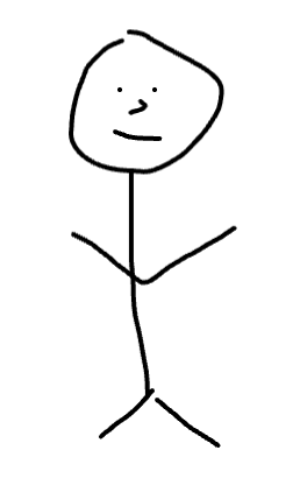
1. Highly conceptual, minimally visual
- Based almost entirely on an idea - specifically the idea of the tactile, outer boundaries of something, not how something actually looks to our eyes
- Mostly symbolic
2. Highly visual, minimally conceptual
- Based entirely on the visual impression - “draw what you see” - drawn how something literally looks to our eyes,
- Impressionist drawings and paintings are based on this approach
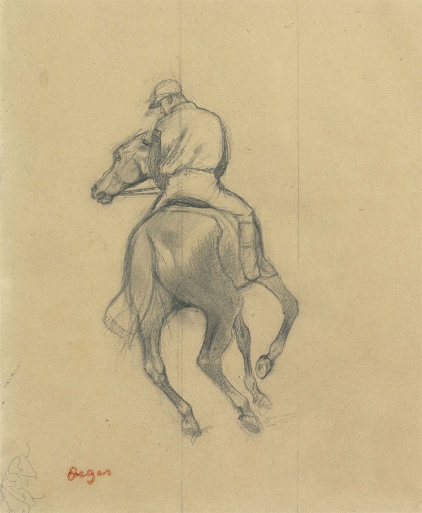
Drawing by Edgar Degas
3. Somewhat visual, somewhat conceptual
- Both visual impression and conceptual knowledge applied.
- (Classical) realism is based on this approach
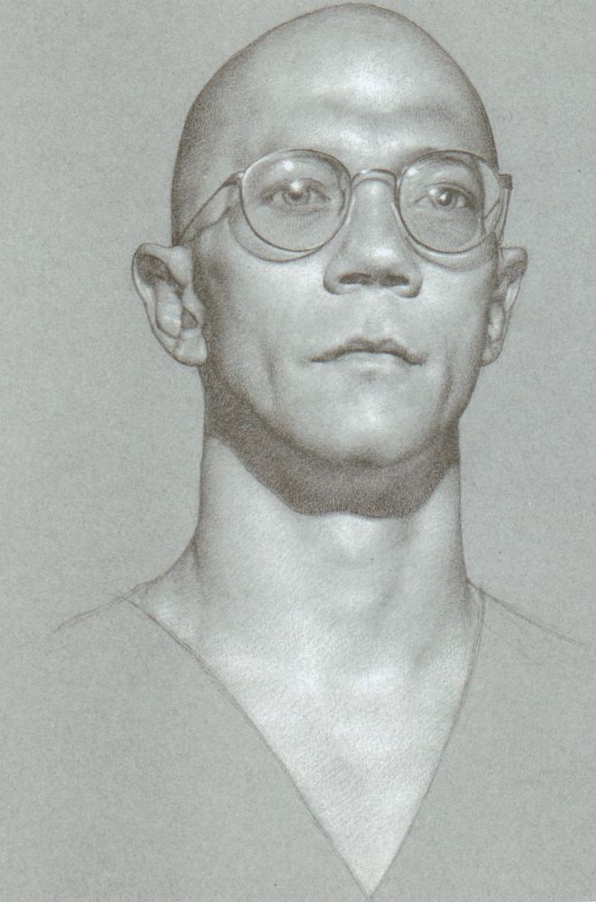
Drawing by Anthony Ryder